Motivation
Over the past ten years, I have received over thousands of emails. I noticed that the bulk of my email communication only increased over past two years. I wanted to visualize the distribution of my emails(sent or received) over the hours, days and years. The example notebook is linked here
Python Libraries used
- NumPy
- Pandas
- Matplotlib
- Mailbox
Goal
- Answer the following questions -
- How many emails did I send during a given timeframe?
- At what times of the day do I send and receive emails with Gmail?
- What is the distribution of emails received per day?
- What is the distribution of emails received per hour?
- Which is my most active day in terms of emails?
Dataset
The data was obtained from Google takeout. Due to privacy reasons, the dataset is not included in this repository. After downloading the dataset containing all the emails, the compressed file was unzipped to obtain file with an .mbox extension. In order to read this, the mailbox library was used. The following fields were extracted from the mailbox object -
- Subject
- From
- Date
- To
- Label - Gmail treats labels as folders for the purposes of IMAP. 1
- Thread - Gmail provides a thread ID to associate groups of messages in the same manner as in the Gmail web interface 1
Steps prior to analysis
- Consisted of removing
NaN - Conversion of dataframe objects to a more suitable data format
- Extraction of email ids from the
fromfield using regular expressions - Dropping unneccessary columns
- Refactoring timezones using
pytzandpandas
Analysis
1. Number of Emails
- Timeframe considered -
- Start of dataset: Mon 12 Sep 2011 04:12 AM
- End of dataset: Mon 28 Jun 2021 08:53 PM
- How many emails were received and sent?
- Received = 62180
- Sent = 1172
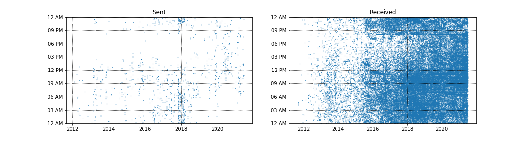
- Here is a scatter plot for the distribution of emails sent and received per time of day
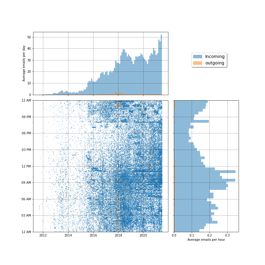
2. Average Emails per day and per hour
- Here is a triple plot for time of the day versus year for all the emails within a given timeframe
3. Emails as per days of the week
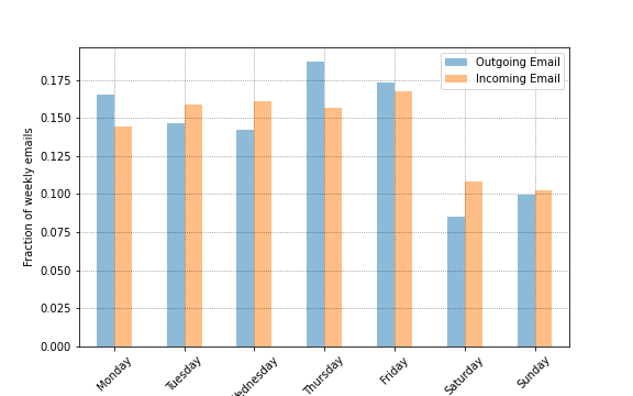
- As seen by the bar chart, most of the outgoing emails were sent on Thursday and most of the incoming emails were received on Friday
4. Most active time of day for Email Communication
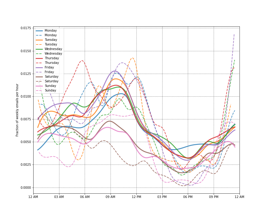
- From the graph, we can see the most active hours for my email communication
-
Source: Gmail for developers ↩ ↩2